We haven’t touched our home page in years. It’s our front door. It’s what people see when they first hear about Stunning. We need to do a better job of explaining our positioning and what we do better than anyone else.
So now it’s time for some homepage tweaks. The reason I’m just going to tweak it and not go for a full redesign right now is that we have a growth experiment coming very soon, and the page needs to change to support that. The full redesign and new positining comes later.
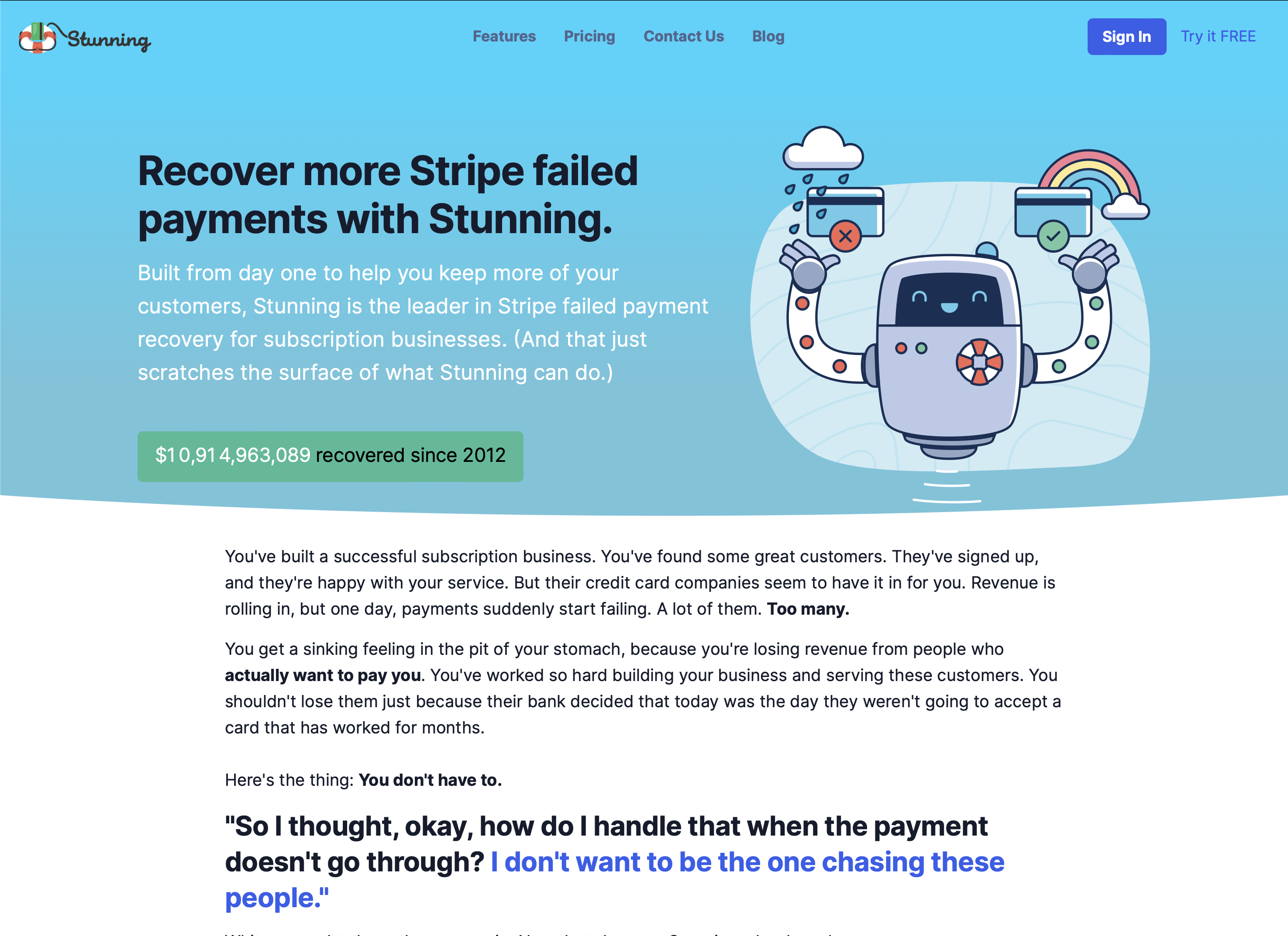
I really just focused on the top part this time, since it’s time sensitive. It used to look like this:
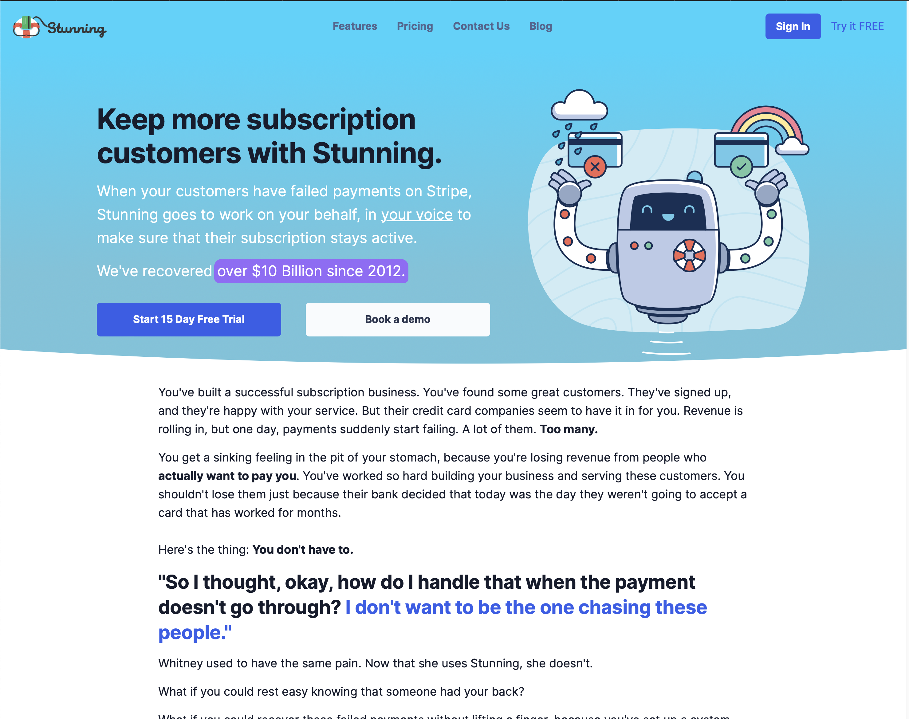
and now it looks like this:
The reasoning here is that we’ve always highlighted how much revenue we’ve recovered over the years. It worked fine when we’ve recovered $250,000, or even somewhere in the millions. But as the number has grown, it’s been more and more disconnected from what people can even wrap their heads around. There are just too many digits when you get into the billions.
Also, it’s always bothered me a bit that it looked like a button. So after reading this tweet from my friend Jesse I decided it was time to take action:
sound like a broken record but if you're an indie you really gotta have a "book a demo" link on your homepage.
— ˗ˏˋ Jesse Hanley ˎˊ˗ (@jessethanley) July 5, 2024
this tweet generated >20 demos over the last 2 days and a lot of pipeline.
if I didn't have that link most of those people would have bounced and forgotten @bento. https://t.co/4Bnsi4402M pic.twitter.com/GQmBSamiyz
I decided to move the amount recovered into the paragraph, highlight it with an animation, and to use the space for buttons to sign up or book a demo.
And while I was at it, I rewrote the headline and the intro text as well.
We’ll see how it goes! You can check out the tweaks here: stunning.co